I have just put up a brand new case study for my recent branding and identity work for PMB Projects.
PMB is a company that offers landscaping and residential construction services throughout Toronto, Canada.
Brent from PMB got in touch with me because he needed to create a recognisable, professional brand and identity for his company. After our initial consultation, I had a much more rounded picture of who PMB Projects are. We looked at where the company currently is and what branding is required to help grow the business and meet its goals.
“I want something that looks good, is original, and that can be recognised down the road as belonging to PMB”Brent Bennison, Director PMB Projects
Brent was a model client who knew what he was looking for, he could articulate what makes his company unique: “utilising actual Project Management methods and tools in our estimates/projects to ensure quality” and had a clear vision of where the business is heading in the next 5 years. He spoke with a real passion about his business and it showed in the quality of the work they produce.
The company was well established in the area and already had a website and social media advertising their services. However, they had no real logo or company branding to speak of. I felt the addition of this could really help take the company to the next level.
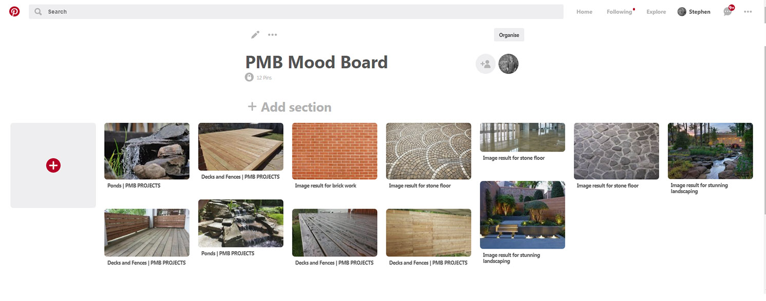
After the initial consultation, the next stage was to put together a mood board of images for ideas and inspiration for the logo. In particular, I was looking for shapes and themes that could be incorporated into the design. I personally love using Pinterest for this.
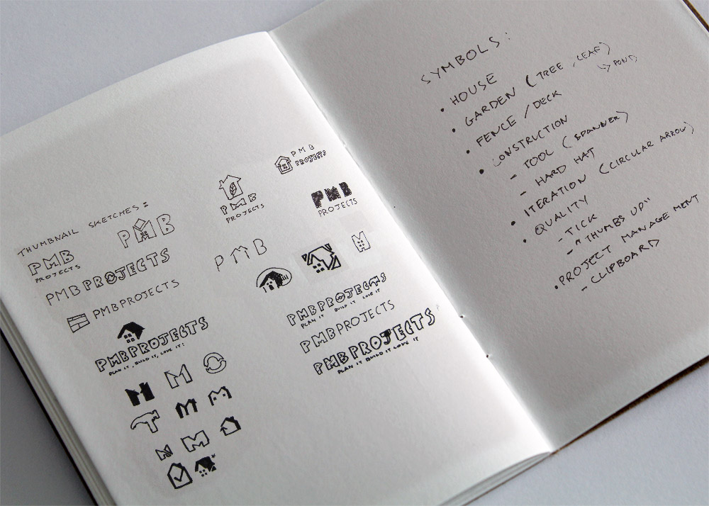
The next stage was to start drawing out thumbnail sketches on paper. Rather than going right to the computer, this is a fast way to get out lots of ideas quickly and see if there are any winners. For PMB, this was exploring shapes and ideas that would signify the business such as the residential, natural, construction or project management themes.
With a final idea in mind, this was drawn up in Illustrator and then finally, colour was added to create the final logo.
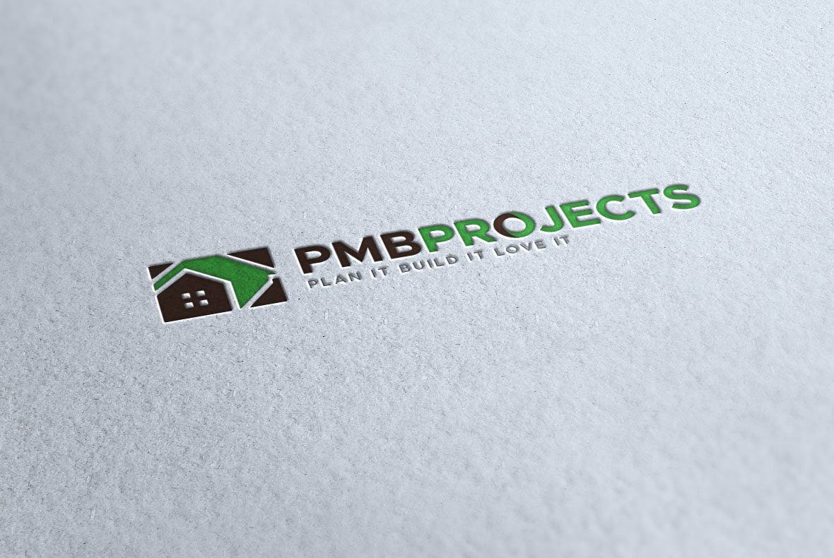
The final logo consists of a bold-sans serif font to represent the strength and reliability aspects of the business. A green and brown colour palette was used for its “natural” connotations to represent both the landscaping service and the use of natural stone and wood used in PMB’s beautiful craftsmanship.
The type was combined with a mark. The house was chosen as this was a perfect representation of all of the services together, whilst still keeping its simplicity and therefore being recognisable.
![]()
Overall, the brief was to create a professional identity that incorporated the natural, construction and project management elements of the business together, which I felt was successfully achieved.
“Stephen is wonderful to work with. His professional step by step method made reaching the final product a simple process. The end result is both functional and beautiful. Yet another example of why you always hire the right people! Cheers Stephen!”Brent Bennison, Director PMB Projects
This was a really enjoyable project and an exciting change to go international!
Go and check out the full case study and finished project here.