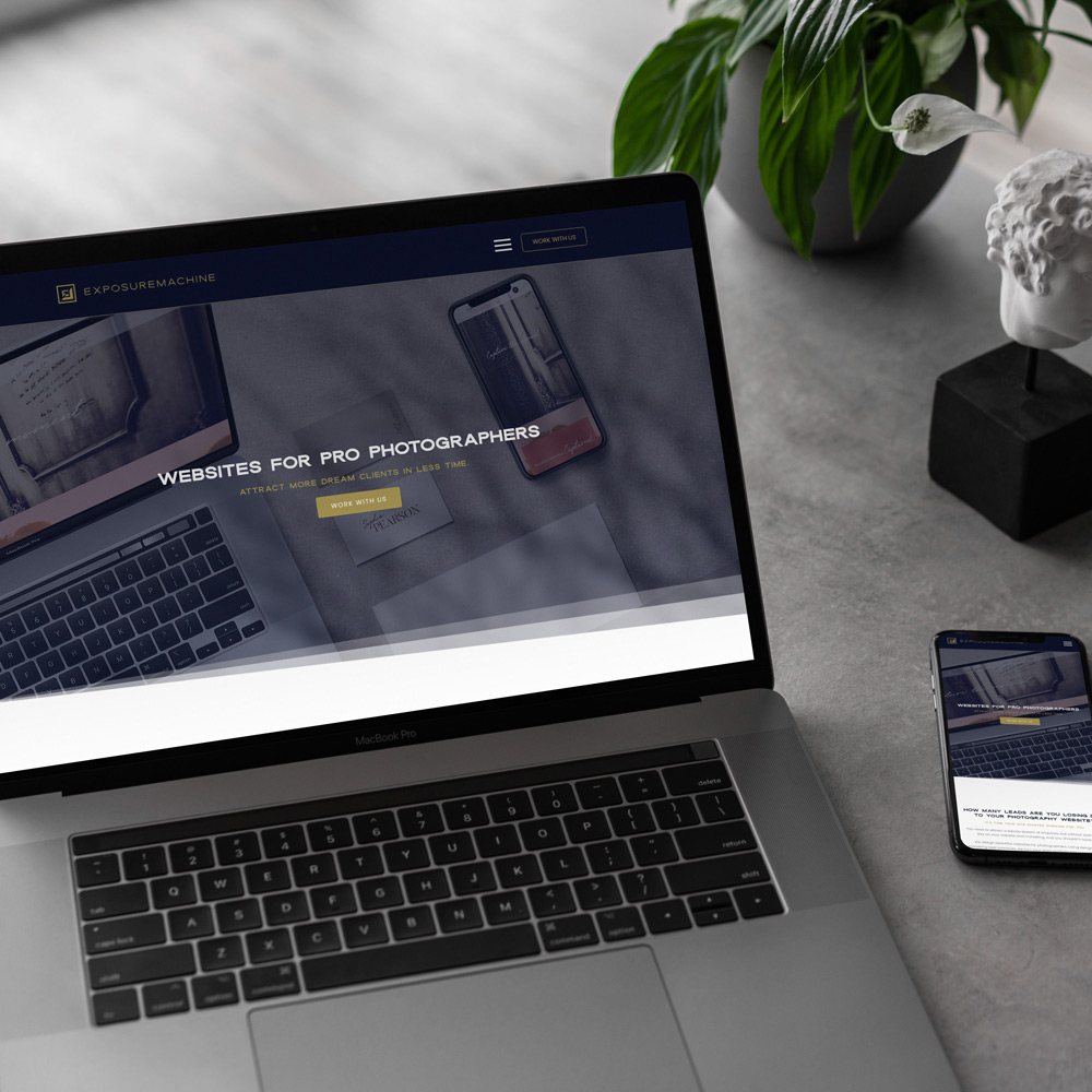
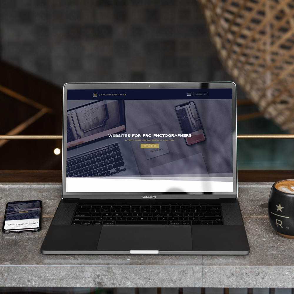
Exposuremachine are a web design agency that offers beautiful, SEO-optimised websites for professional photographers. Their websites are designed to help photographers attract more clients and ultimately save time in growing their photography career.
The brief was to produce a brand that would differentiate them from the DIY website builders on the market and position them as a premium design agency, a high-end done for you service.
THE RESULT
A beautiful and unique sans-serif called Dallas was the starting point for the logotype. The “O” represents a lens – a nod to the target market. This was paired with a logomark containing the E and M in dark and light – reflecting “exposure” – helping photographers reach more clients.
Exposuremachine have launched and are producing fantastic results for their clients – helping photographers get fully booked and get paid what they are worth.