THE ULTIMATE IN GLAM BRANDING
CLIENT: KIMBERLY LUX
Kimberly Lux is a drag queen persona created by Pietro Paolo Ruotolo. This persona is a newly devised creation with the intention of working in the entertainment industry, specifically for creating shows for events, bars, clubs and TV.
The vision for the brand is to position Kimberly Lux as an established name in the industry with a long-term aim of being able to work full time in entertainment.
To be able to achieve this, a visual identity was created to compliment the already created name for marketing and promotion purposes and to embody the client’s passion for this lifestyle. This logo will be required for use across a variety of media such as print and social media and created with the target audience of the LGBTQ community in mind.
SERVICES
LOGO DESIGN
BRANDING
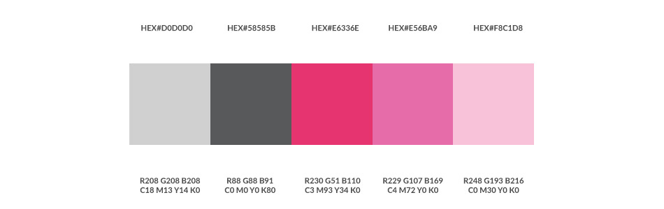
COLOURS
The client, Pietro, had a vision of Pink, Fuchsia and Silver, which was a perfect match for the drag queen persona. Silver represents the “luxury” part of the name and the bright pink and fuchsia is for the feminine and extrovert side. It was then just a case of finding the right shades that would complement each other.
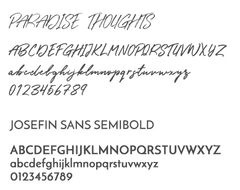
FONTS
The client had a vision in mind of a classy script font crossing the diamond. After trying out lots of different typefaces, Paradise Thoughts was settled on as it has the perfect handwritten script style. It had to be edited in Illustrator to smooth out the rough edges to work with the metallic look and to make the letters more bold.
A bold sans-serif was needed for the K and X to contain the diamond. Josefin Sans in a semibold weight was chosen as this was the perfect fit and look.
LOGO EXPLANATION
The logo was created with all of the elements within the creative brief in mind. The client already had a very clear
concept, including colour palette and thumbnail sketches. These were fleshed out into a professional logo whilst trying to keep as close to the original concept as possible.
The main logo is an encapsulated design (sometimes known as a badge),which includes the type and logo mark within one logo, contained within a border.
LOGO VARIANTS
An encapsulated logo was devised but there is scope for flexibility to the design by using the type and mark separately and they can work well on their own.
The colours used on the logo allows for use on light or dark backgrounds.